-
mitar
ro
tony
mitar
ro
tony
General mailing list for discussions and development of PeerLibrary and related software.
List archive Help
- From: Matej Jan < >
- To:
- Subject: Re: [PeerLibrary dev] Possible logo
- Date: Fri, 28 Mar 2014 17:30:33 -0700
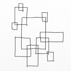
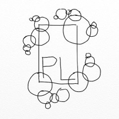
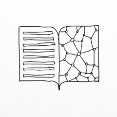
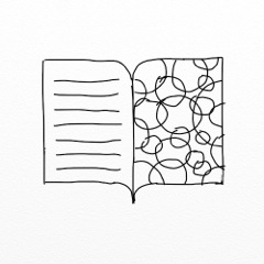
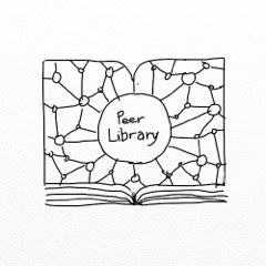
Here are some of my concepts. Let me know if any go into the right direction and I can create more variations on them.
1.
2.
3.
4.
5.
6.
Hi!
One idea. We could make logo very old school, combine P and L and then
do various ornaments around. :-)
I am just not sure how will this align with our minimalistic design.
MitarThis is too abstract for me to comment yet. :-) Will leave to others to
comment. :-)
MitarI dig the ASCII is are the edges and vertices just to symbolize the
connectivity?
Yep, I meant to minimally symbolize that annotations are linked with the
publication and with themselves. (In cloudspeak, "interconnectedness.")
-ro
--
http://mitar.tnode.com/
https://twitter.com/mitar_m
Settings and unsubscription:
http://lists.peerlibrary.org/lists/info/dev
Public archive:
http://lists.peerlibrary.org/lists/arc/dev
- [PeerLibrary dev] Possible logo, Spencer Hitchcock, 03/26/2014
- Re: [PeerLibrary dev] Possible logo, Rodrigo Ochigame, 03/26/2014
- Re: [PeerLibrary dev] Possible logo, Spencer Hitchcock, 03/26/2014
- Re: [PeerLibrary dev] Possible logo, Rodrigo Ochigame, 03/26/2014
- Re: [PeerLibrary dev] Possible logo, Mitar, 03/27/2014
- Re: [PeerLibrary dev] Possible logo, Mitar, 03/27/2014
- Re: [PeerLibrary dev] Possible logo, Matej Jan, 03/29/2014
- Re: [PeerLibrary dev] Possible logo, Mitar, 03/29/2014
- Re: [PeerLibrary dev] Possible logo, Rodrigo Ochigame, 03/30/2014
- Re: [PeerLibrary dev] Possible logo, Matej Jan, 03/29/2014
- Re: [PeerLibrary dev] Possible logo, Mitar, 03/27/2014
- Re: [PeerLibrary dev] Possible logo, Mitar, 03/27/2014
- Re: [PeerLibrary dev] Possible logo, Rodrigo Ochigame, 03/26/2014
- Re: [PeerLibrary dev] Possible logo, Spencer Hitchcock, 03/26/2014
- Re: [PeerLibrary dev] Possible logo, Rodrigo Ochigame, 03/26/2014
Archive powered by MHonArc 2.6.18.
