-
mitar
ro
tony
mitar
ro
tony
General mailing list for discussions and development of PeerLibrary and related software.
List archive Help
- From: Matej Jan < >
- To:
- Subject: Re: [PeerLibrary dev] Possible logo
- Date: Thu, 14 Aug 2014 15:50:59 -0700
Here’s a new iteration on the logo:
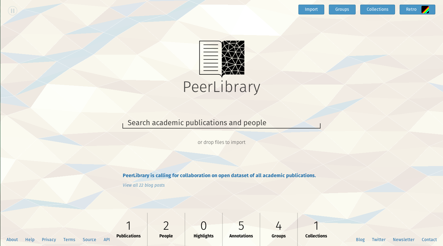
This is how it looks in the webpage:
And a simplified icon version (I can make it more pixel perfect):
A little explanation:
The logo is a play on the publication-left, annotations/discussion-right design of PeerLibrary. The triangles on the right match the triangles in the frontpage background, which, at least to me, remind me of the surface of the brain. The whole logo in fact is a play on the left-right hemispheres of the brain, while also being in the shape of a book. It connects science with publications, which is what we’re primarily about.
I think it’s good for a start, but I don’t mind if somewhere along the way we iterate more or replace it holistically altogether.
Yeah, I’ll iterate more on the web network and see what minimized versions I come up with.
On Jun 17, 2014, at 4:31 PM, Rodrigo Ochigame < > wrote:#1 is pretty fresh, conceptually and aesthetically. Props! :-)
I scaled it down to 160px wide and it looked okay, but Mitar makes an important point. Could we try fewer lines and zoom a bit into the graph, maybe?
-ro
On 6/17/14 5:02 PM, Mitar wrote:Hi!Settings and unsubscription:
For me #1 looks too complicated. :-( Think about scaling. It should work
both on small stickers to big t-shirts. Where is minimalism?
Mitar+1 on the first
On Tue, Jun 17, 2014 at 1:17 PM, Tony Chen < > wrote:+1 on the first one
------------------------------
From: Spencer Hitchcock < >
Sent: 6/16/2014 4:14 PM
To:
Subject: Re: [PeerLibrary dev] Possible logo
the first is really beautiful.
On Mon, Jun 16, 2014 at 4:12 PM, Matej Jan < > wrote:Finally, here are the vector variations of concept #4:
But I went and tried to minimize it further and came down to something
closer to a black variation of #6:
Here it is in smaller sizes:
And white variations
Let me know if you want to proceed with this.
On Apr 1, 2014, at 11:31 PM, Matej Jan < > wrote:
Sounds good, i'll prepare variations on #4. They will be done in
vectors so no worries about svgs.
On Apr 1, 2014, at 9:08 PM, Spencer Hitchcock < >
wrote:
Tony, Rodrigo, Mitar, and I like 4.
Would you like to develop it further?
I'd be willing to create an SVG image of it
On Fri, Mar 28, 2014 at 5:30 PM, Matej Jan < > wrote:Here are some of my concepts. Let me know if any go into the right
direction and I can create more variations on them.
1.
<PeerLibraryLogoConcept1.jpeg>
2.
<PeerLibraryLogoConcept2.jpeg>
3.
<PeerLibraryLogoConcept3.jpeg>
4.
<PeerLibraryLogoConcept4.jpeg>
5.
<PeerLibraryLogoConcept5.jpeg>
6.
<PeerLibraryLogoConcept6.jpeg>
On Mar 27, 2014, at 12:43 PM, Mitar < > wrote:
Hi!
One idea. We could make logo very old school, combine P and L and then
do various ornaments around. :-)
I am just not sure how will this align with our minimalistic design.
Mitar
This is too abstract for me to comment yet. :-) Will leave to others to
comment. :-)
Mitar
I dig the ASCII is are the edges and vertices just to symbolize the
connectivity?
Yep, I meant to minimally symbolize that annotations are linked with the
publication and with themselves. (In cloudspeak, "interconnectedness.")
-ro
--
http://mitar.tnode.com/
https://twitter.com/mitar_m
Settings and unsubscription:
http://lists.peerlibrary.org/lists/info/dev
Public archive:
http://lists.peerlibrary.org/lists/arc/dev
Settings and unsubscription:
http://lists.peerlibrary.org/lists/info/dev
Public archive:
http://lists.peerlibrary.org/lists/arc/dev
Settings and unsubscription:
http://lists.peerlibrary.org/lists/info/dev
Public archive:
http://lists.peerlibrary.org/lists/arc/dev
Settings and unsubscription:
http://lists.peerlibrary.org/lists/info/dev
Public archive:
http://lists.peerlibrary.org/lists/arc/dev
http://lists.peerlibrary.org/lists/info/dev
Public archive:
http://lists.peerlibrary.org/lists/arc/dev
- Re: [PeerLibrary dev] Possible logo, Matej Jan, 08/15/2014
- Re: [PeerLibrary dev] Possible logo, Mitar, 08/15/2014
- Re: [PeerLibrary dev] Possible logo, Tony Kaitong Chen, 08/15/2014
- Re: [PeerLibrary dev] Possible logo, Rodrigo Ochigame, 08/15/2014
- Re: [PeerLibrary dev] Possible logo, Seema Hari, 08/15/2014
- Re: [PeerLibrary dev] Possible logo, Rodrigo Ochigame, 08/15/2014
- Re: [PeerLibrary dev] Possible logo, Tony Kaitong Chen, 08/15/2014
- Re: [PeerLibrary dev] Possible logo, Mitar, 08/15/2014
Archive powered by MHonArc 2.6.18.

